Tatak Studio is a boutique marketing agency working with clients all over the globe who are looking to build, grow, and take businesses to the next level. They use strategic marketing to place their client’s business in front of their market - right audience, right offer.
The Challenge
Tatak Studio is looking to boost their online presence so that they can diversify their channels for getting clients. However, their current visual identity is outdated — it no longer represents their business and what they do. Before they can start building their online presence, they needed a visual identity that accurately communicates their brand.
What We Did:
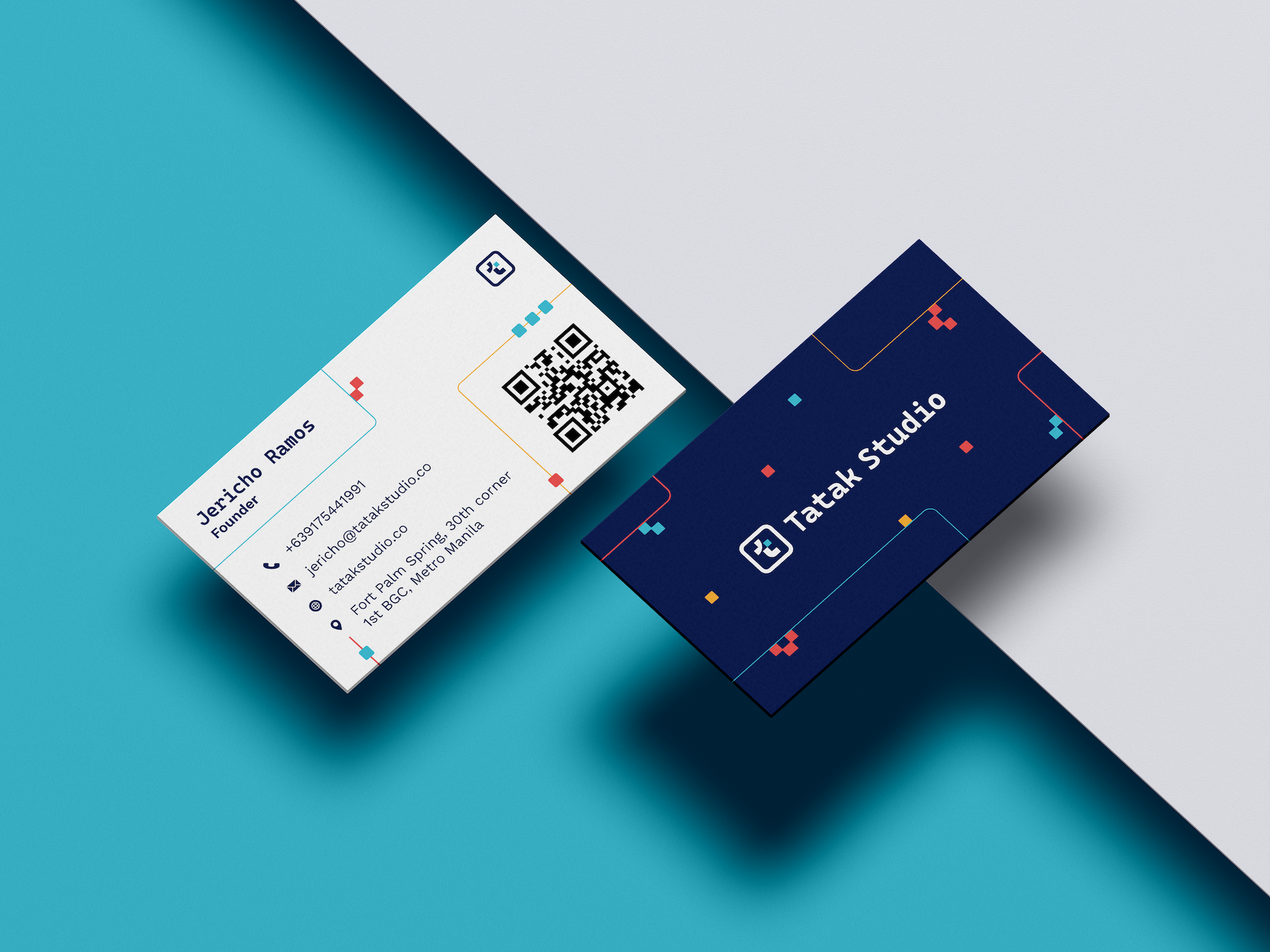
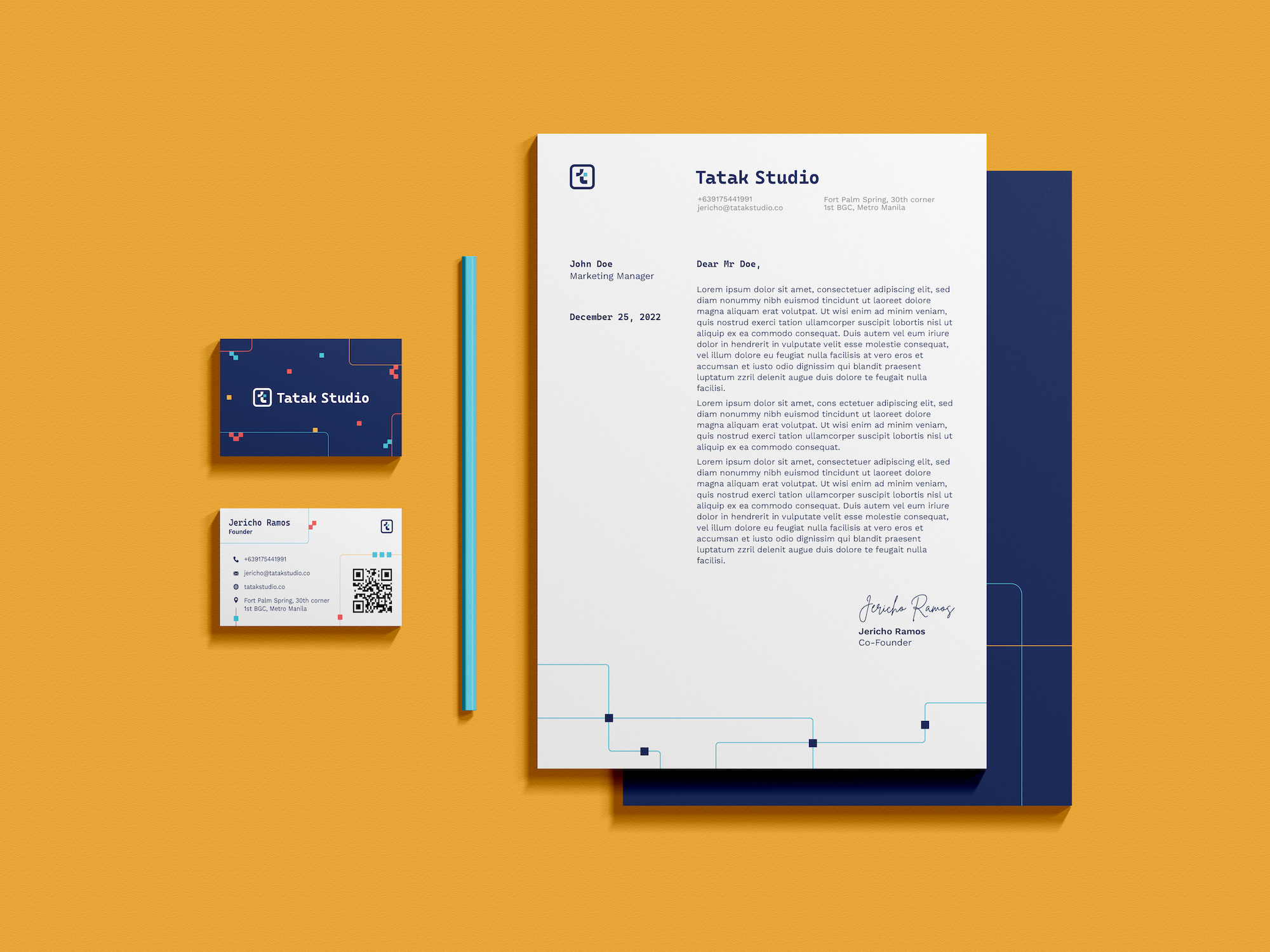
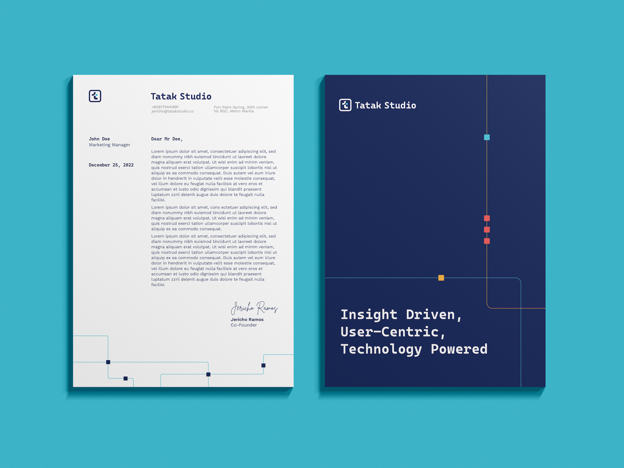
Logo Design Key Visual Design Colors and Fonts Style Guide Business Card and Letterhead Design
Establishing the creative direction
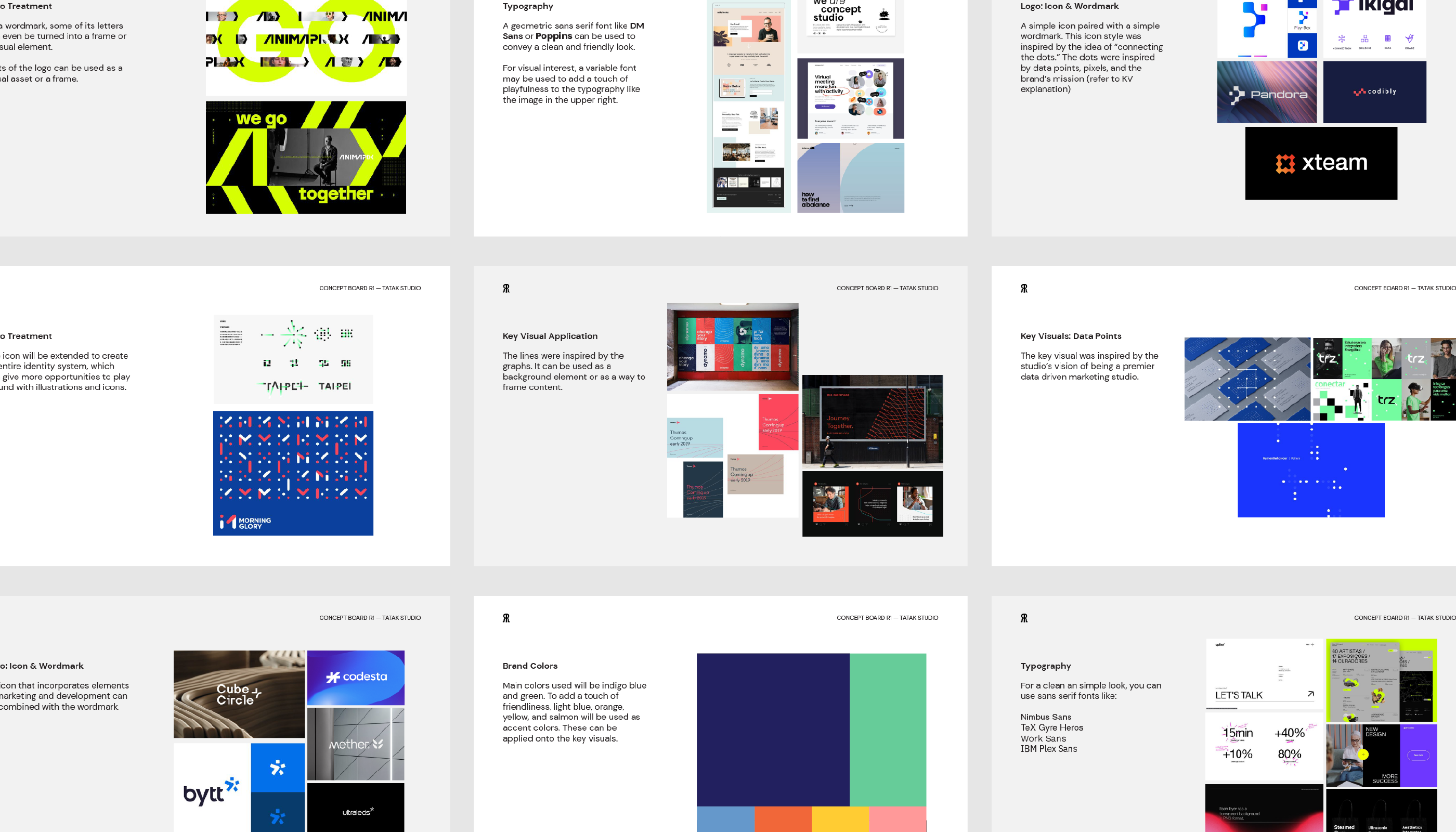
Before anything else, we started with establishing the creative direction through our concept board.
The concept board contained curated images that helps our clients visualize their logo, colors, fonts, key visuals, and its application.
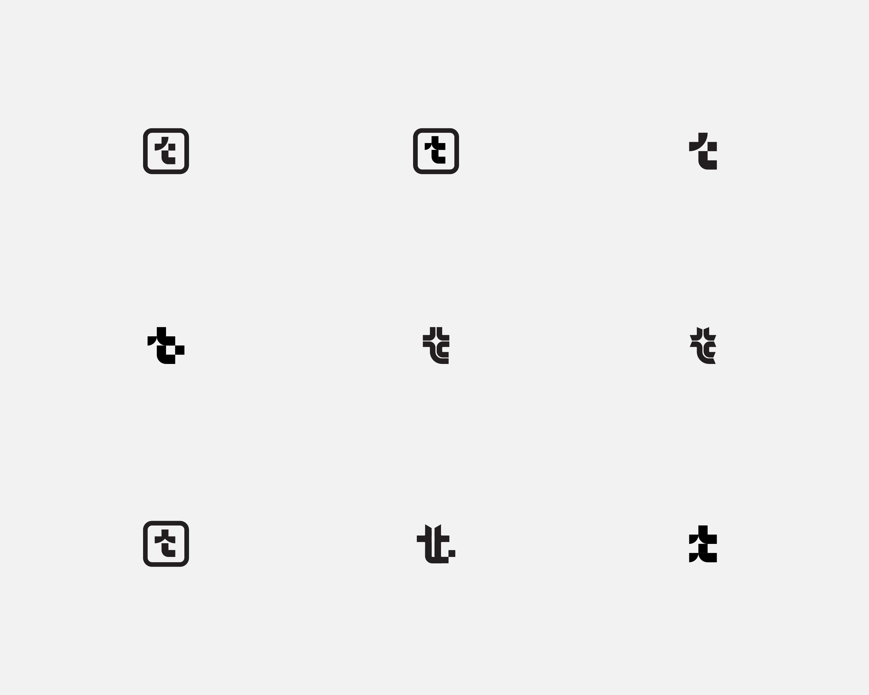
The Logo
We presented 3 concepts to choose from along with variations.
Their Visual Identity revolves around their vision of being one of the premier data-driven marketing studio in the Philippines.
The logo and key visuals focused around the keywords: Data points, web, business growth, business scaling.
Further Exploration
Given that the letter t can be a common icon, we took the chosen concept a step further by doing additional explorations.
Brand Colors
The primary brand colors took into account the original colors Tatak Studio used before the redeisgn. The secondary palette was designed to complement and balance the primary brand colors. This also helps add a touch of friendliness to the brand.
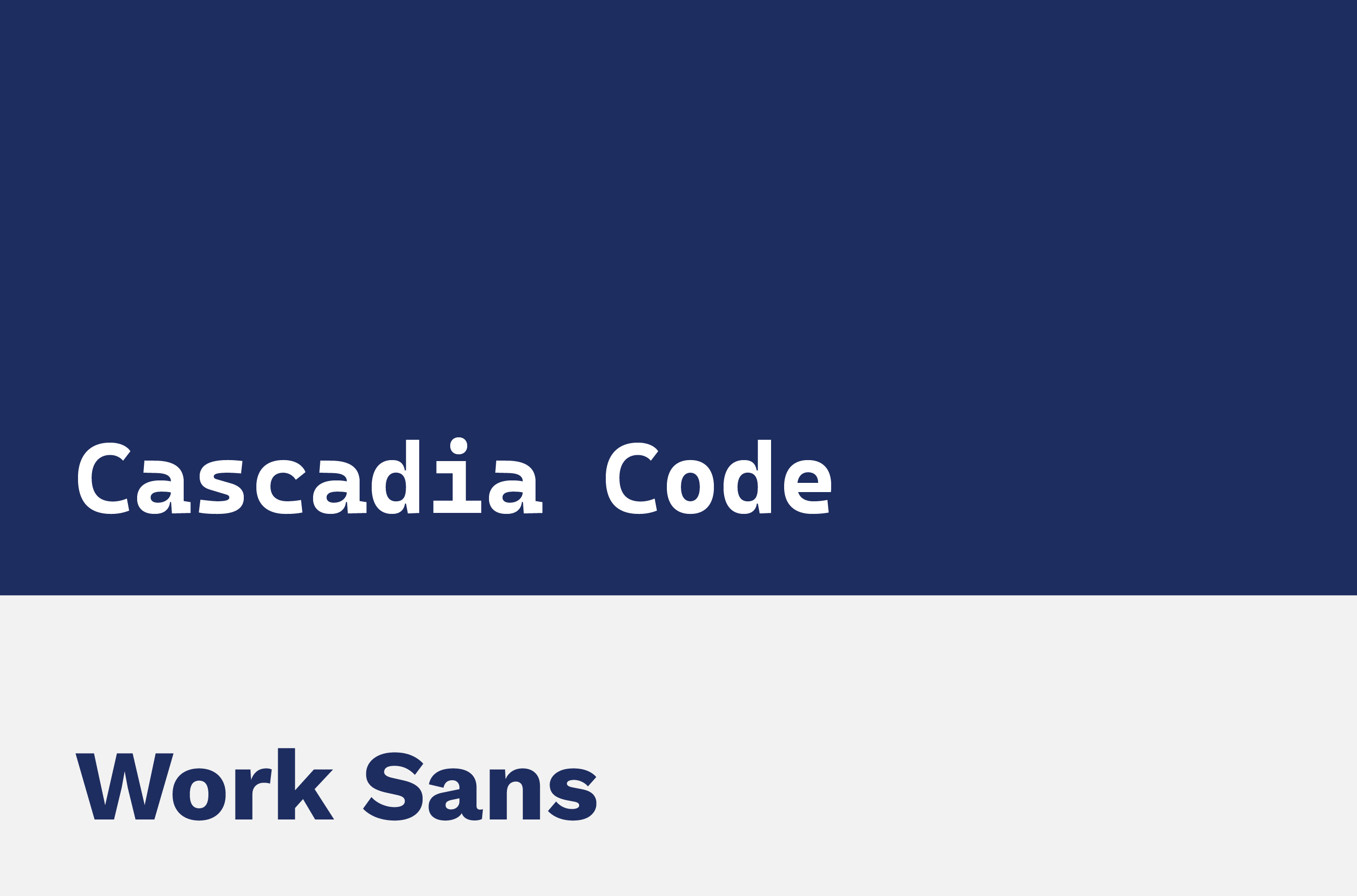
Brand Fonts
Cascadia Code is a monospace typeface created by Microsoft for public use. It pays tribute to Tatak Studio’s origin of initially being a web design and development agency. For a clean and professional look, work sans was used as the secondary typeface.
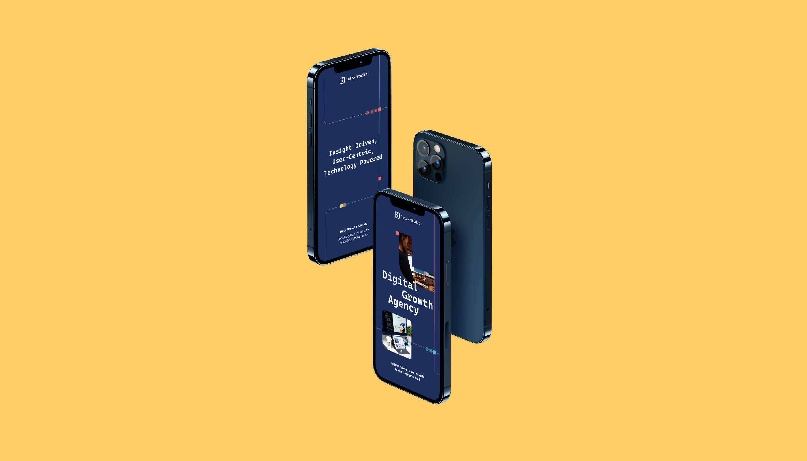
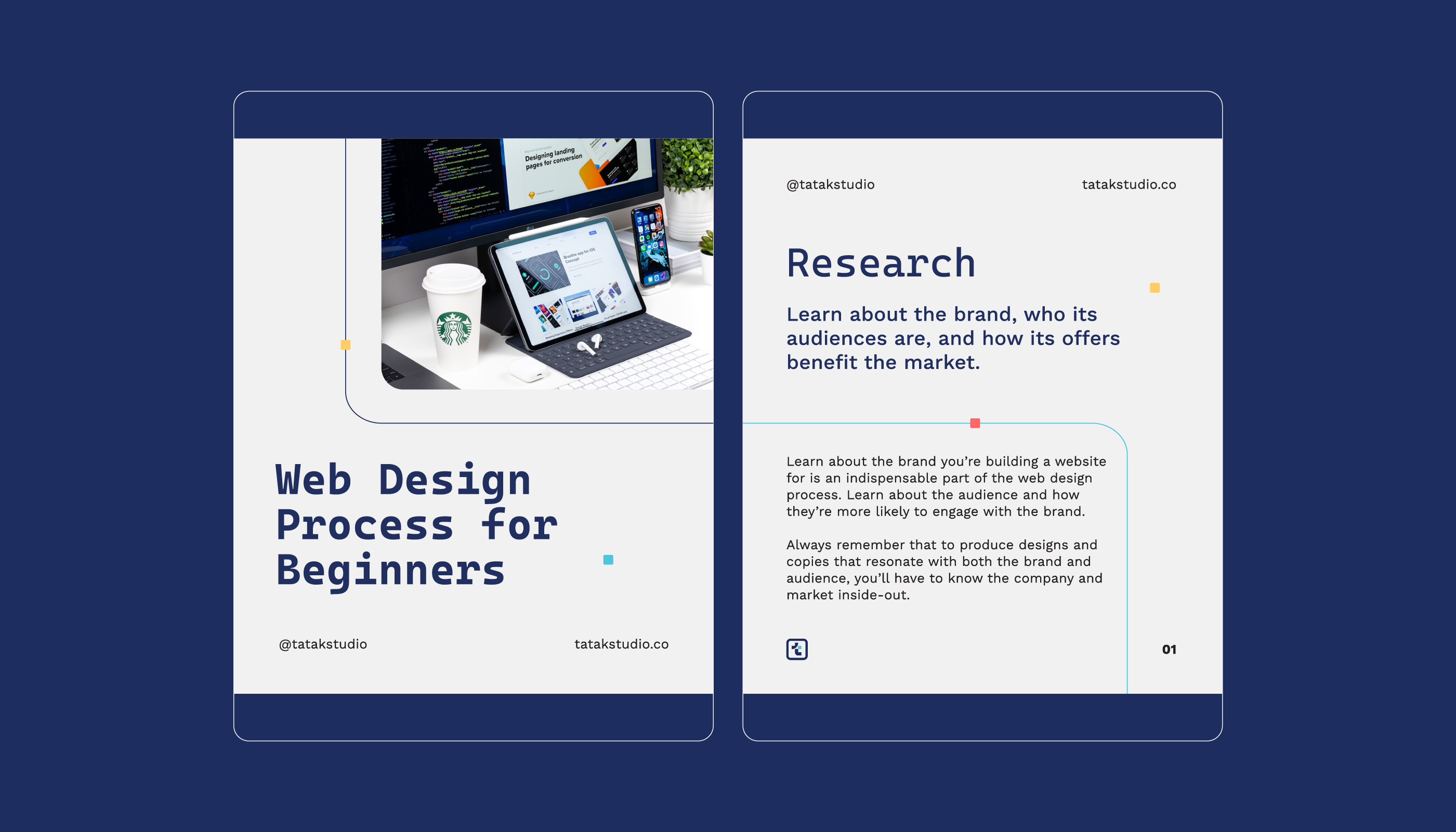
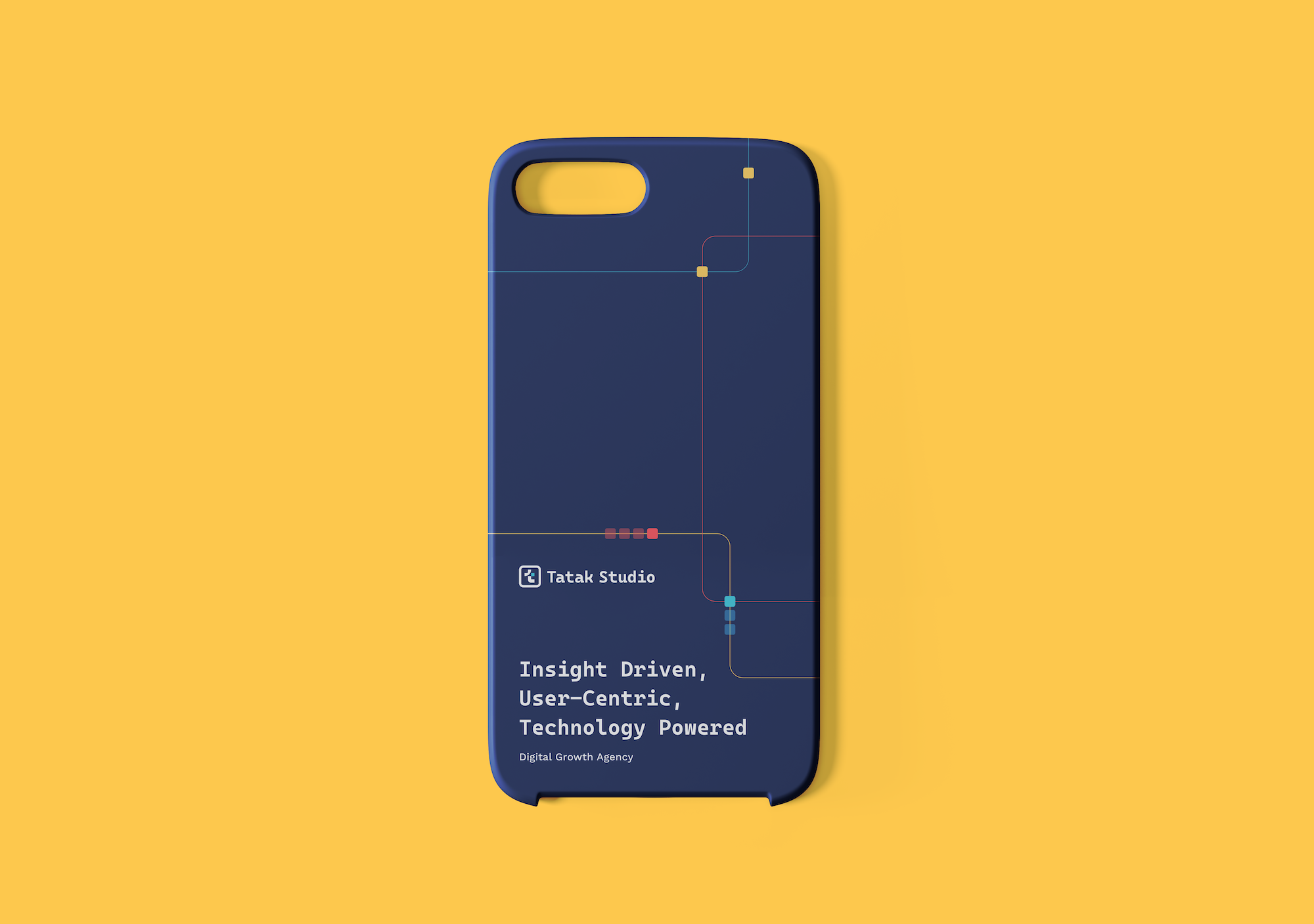
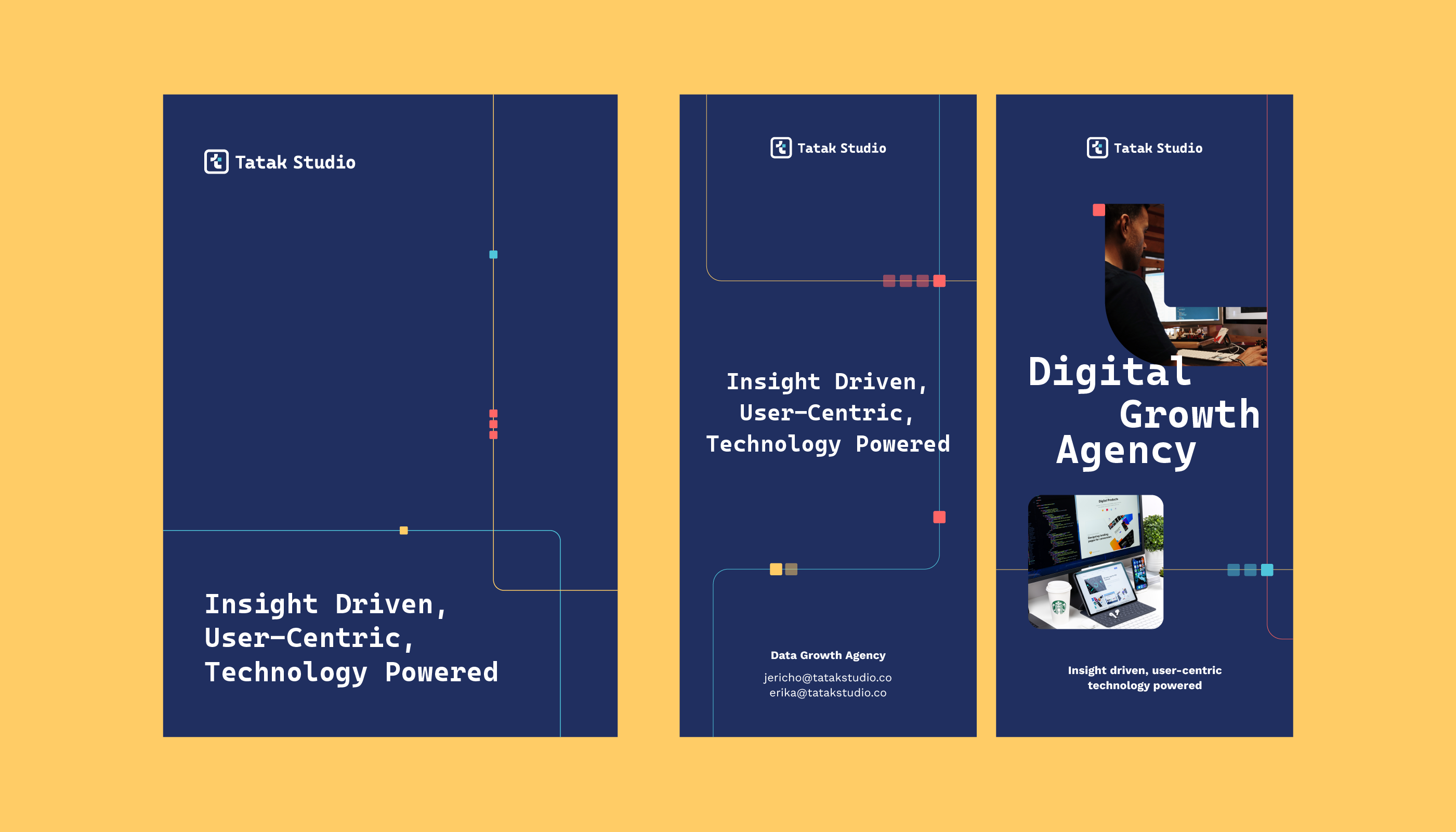
Key Visuals: Data Points
Given that Tatak Studio is a data-driven marketing agency, the main key visual was inspired by the idea of data points.
The second key visual, the connectors, was inspired by the brand’s mission of bringing the right business with the right offer to the right audience at the right time. In a way, the studio acts as a connector between businesses and customers.
These key visuals can be used as background or design elements, or as a way to frame specific content.