Hulya a plant education/retail store that centers around health, well-being and communication. It gives its customers the option to grow their own food or buy organically grown food from Hulya’s garden. Unlike other plant retail stores, Hulya also offers cooking demonstrations, plant nurturing classes and gardening workshops.
Hulya would like to give young Filipinos more access to quality garden supplies meant for urban gardening, provide more seed varieties, and offer more efficient pots, soil mixtures, and hybrid plants the produce more output with less input.
The Goal
As a start-up, Hulya would like to grow into a recognizable brand that stands out in the growing plant education and retail industry. Hulya also wants to encourage its audience to start their own garden and promote the use of environmentally friendly and sustainable tools and methods.
The Outcome
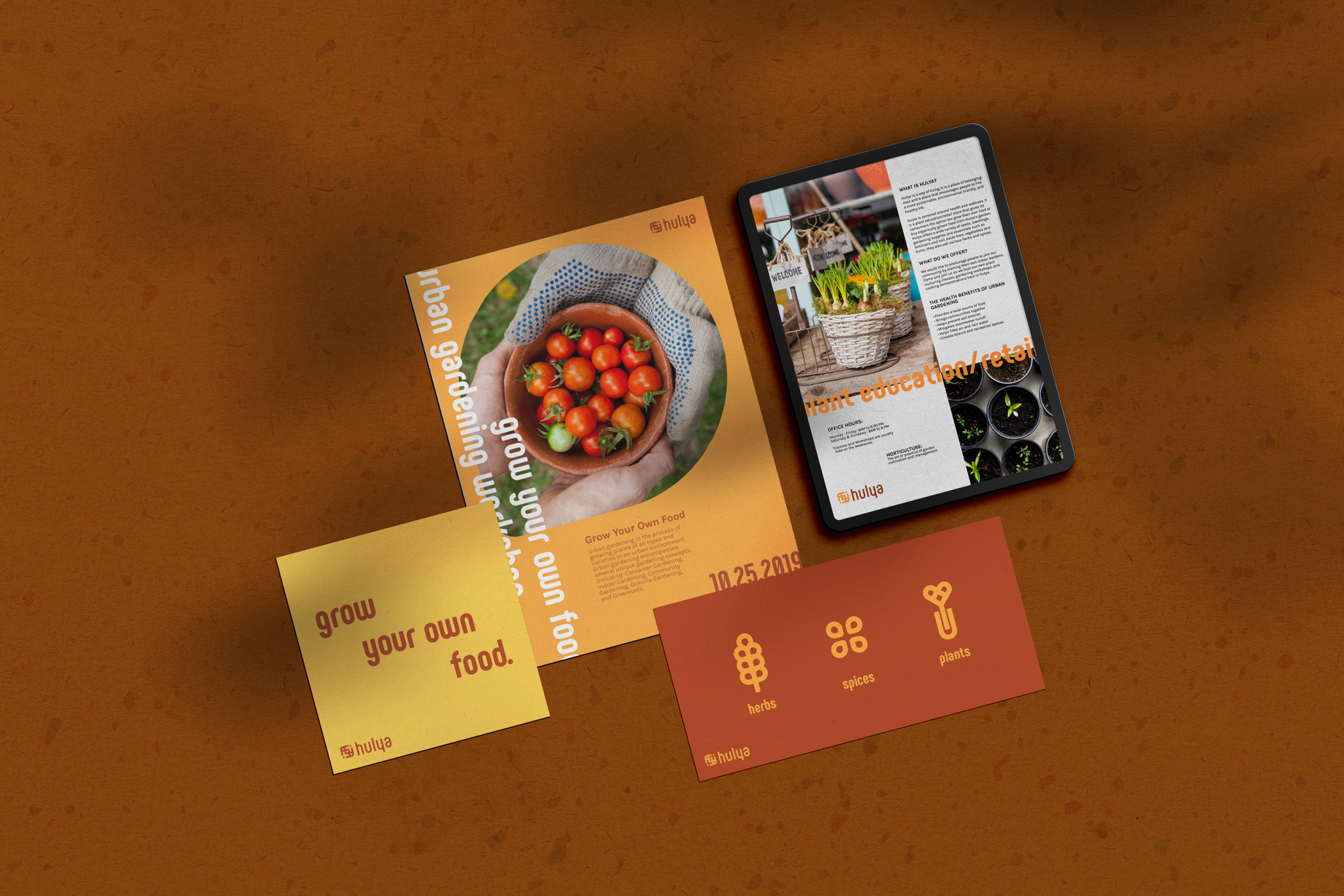
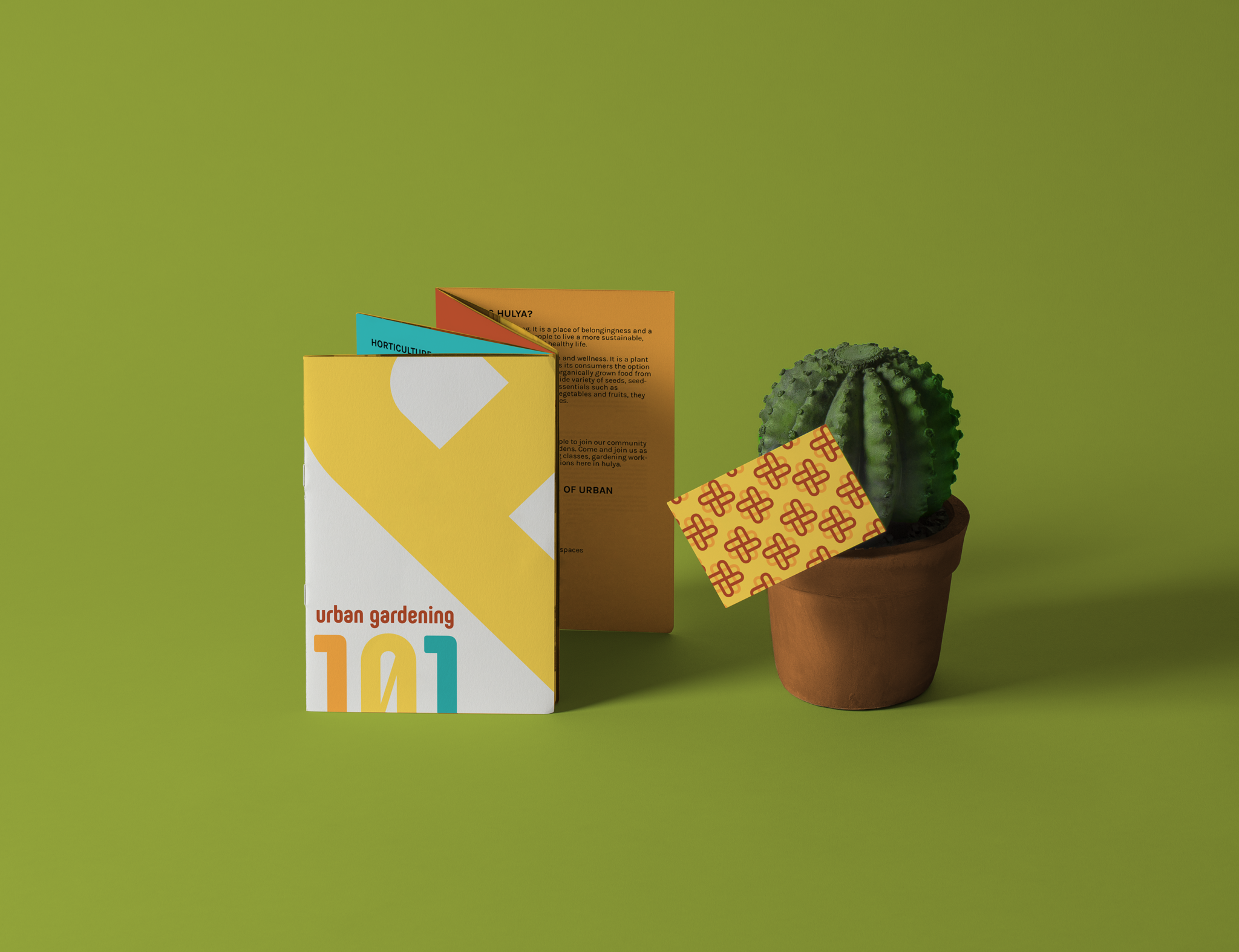
Hulya's visual identity perfectly communicates its personality of being welcoming, friendly and sustainable. After creating the identity, we then created the the brand's packaging and print materials, which will then be used to call its customers into action.
Understanding the users and establishing the creative direction
For Hulya to encourage its customers to take action and live a sustainable lifestyle, it's important for the, to understand the needs and behaviours of the customers. We created a ideal client persona that best represents Hulya's market.
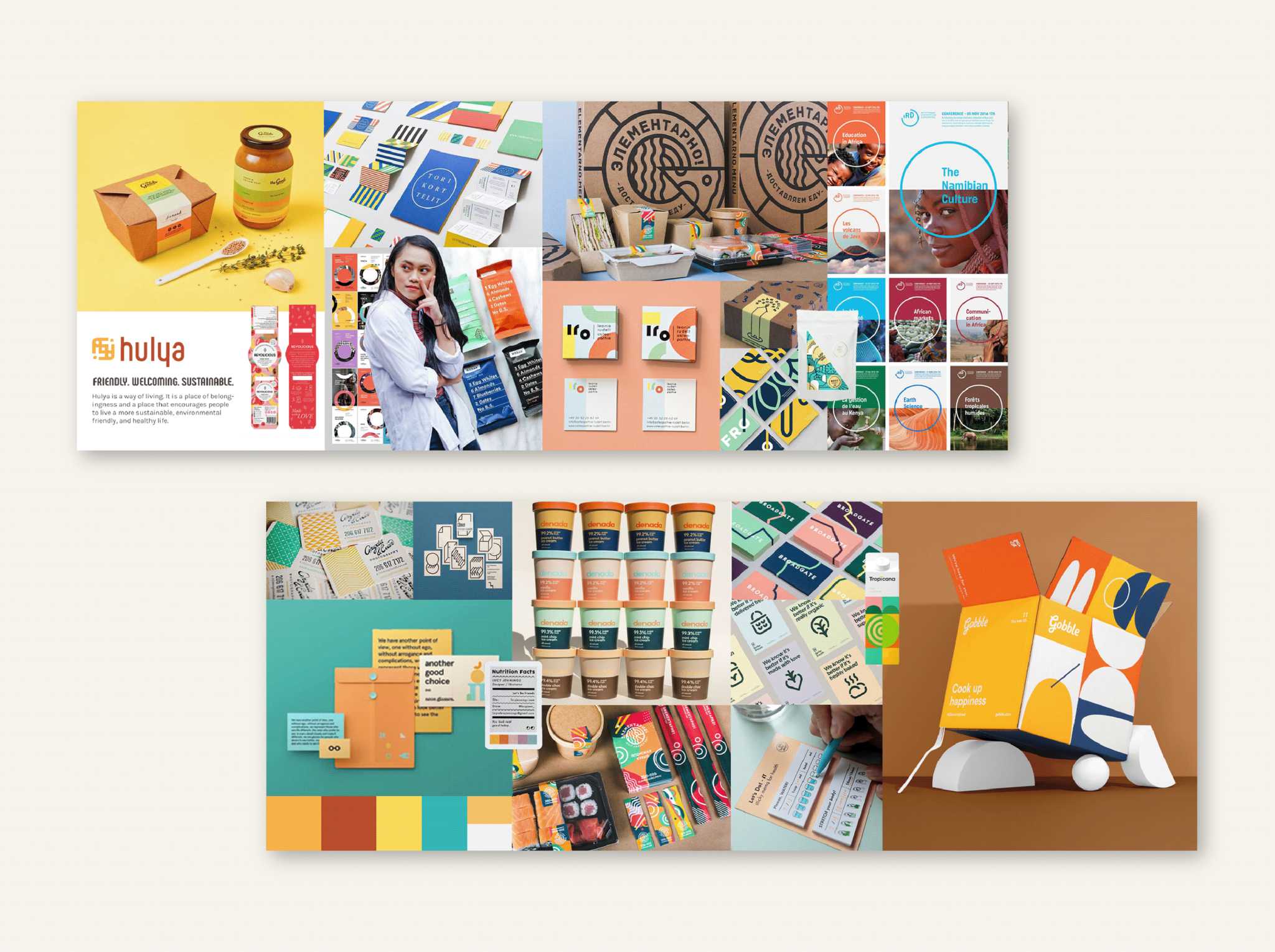
We then created stylescapes to establish a creative direction that is aligned with Hulya's customers,
Concept and Design Development
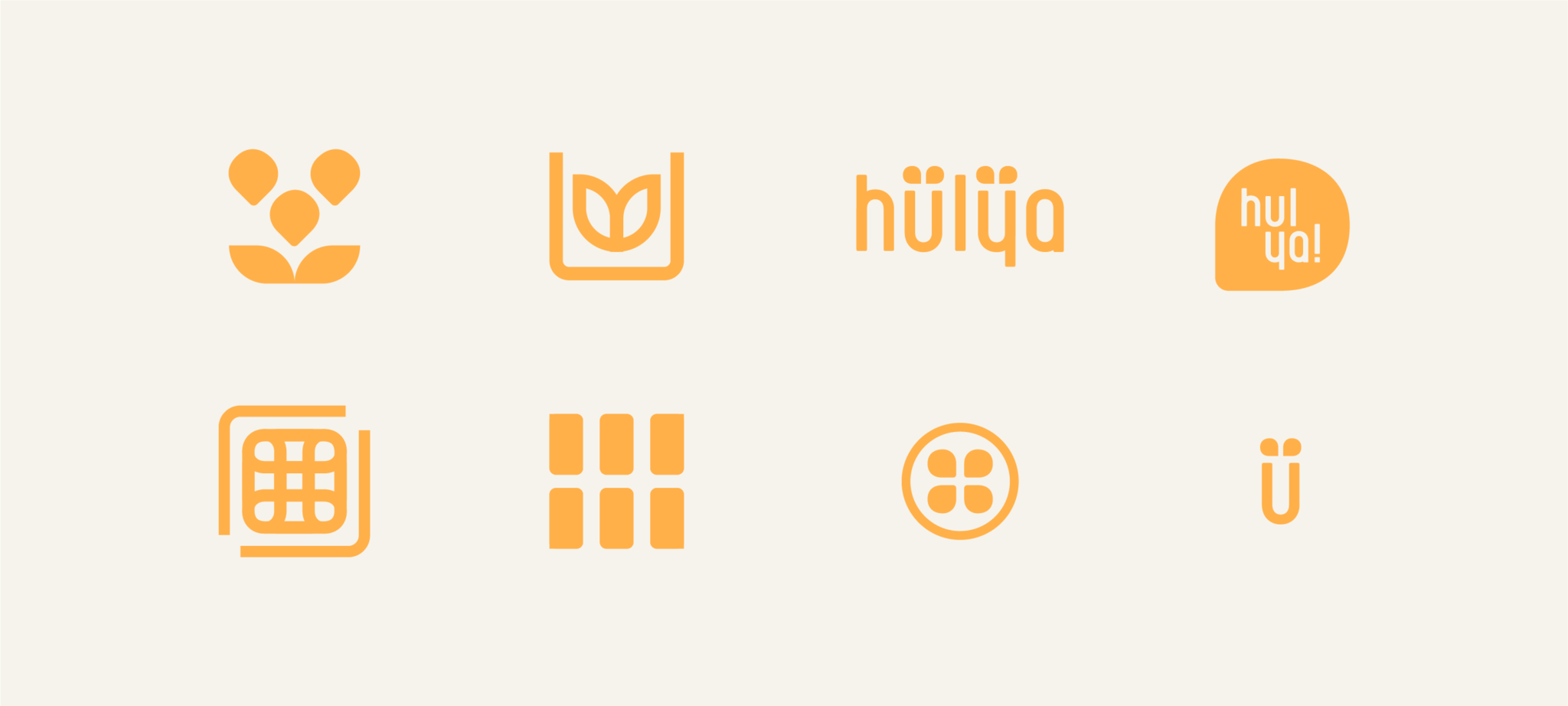
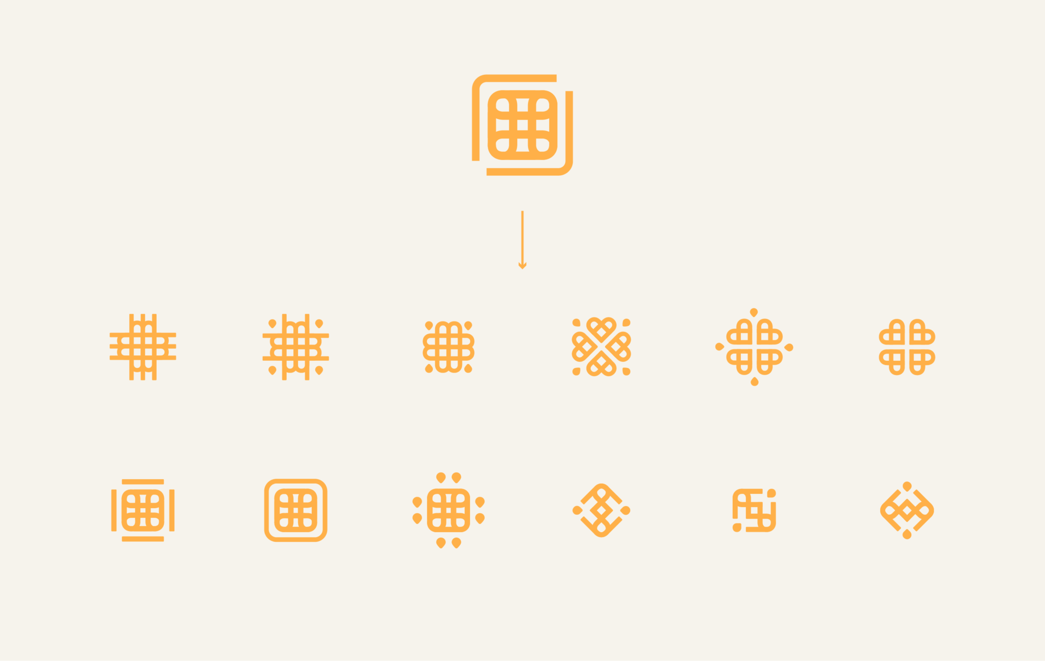
The challenge was to create a mark that is unique, but at the same time familiar. Given that Huyla was in the plant retail and education industry, it was important for me to stray away from the usual ‘plant’. ‘agriculture’, and ‘leaf concepts’ In this stage, it was also important for me to explore concepts that can also evoke the brand’s personality.
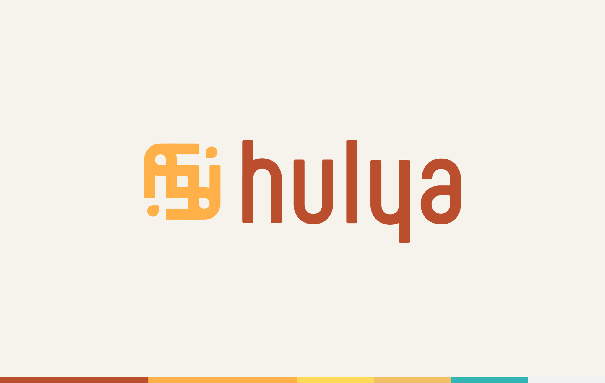
Wordmark
The font used for the logo complements the brand's personality of being friendly, playful, and sustainable. Phenomena Bold, the font, is a modern sans serif font based on round geometric shapes. The rounded corners softens the overall proportions and supplements the geometric aesthetics of the family. The colors of the brand strays away from the usual green colors. Instead of green, the brand uses orange, which evokes energy and friendliness, and brown, which ties the brand to agriculture.
In order for the wordmark to harmonize well with the icon, I modified the thickness of the font to match the strokes of the icon. In order to make it seem more cohesive, I matched the counter of the ‘a’ with the seed like elements of the icon. I also made sure to modify the height of the h and y.
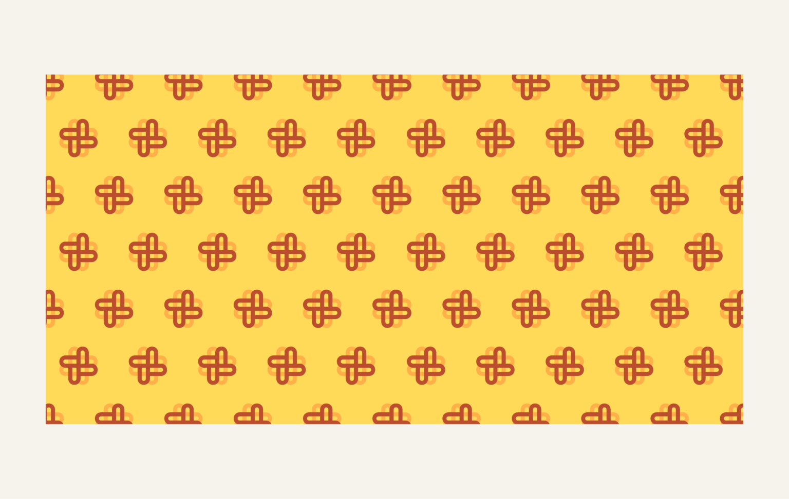
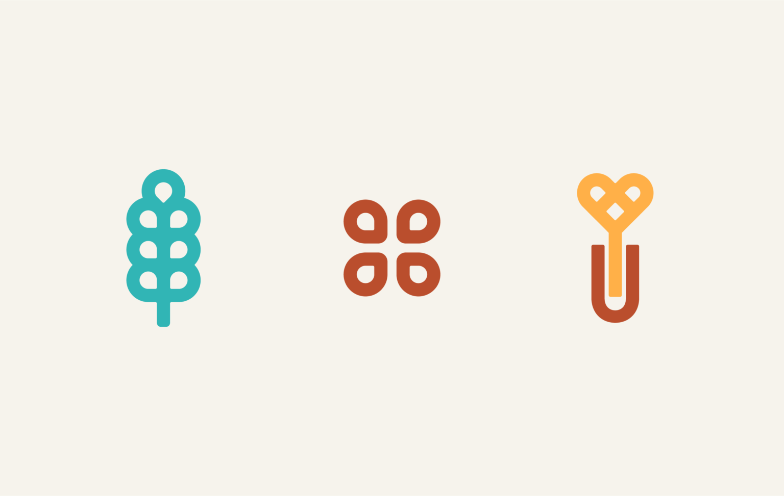
Patterns and Illustrations
The icons and illustrations used must also be in line with the monoline style of the logo. Typically, the icons must also contain elements from the logo. Due to the logo’s versatility and flexibility, it’s very easy to create icons using parts of the logo.
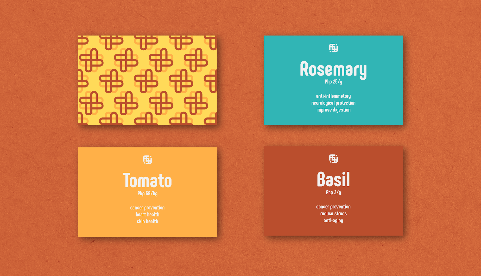
The first step to encouraging people to live a healthier and more sustainable lifestyle is through education and awareness. This can be achieved by giving its customers an efficient and informative shopping experience.
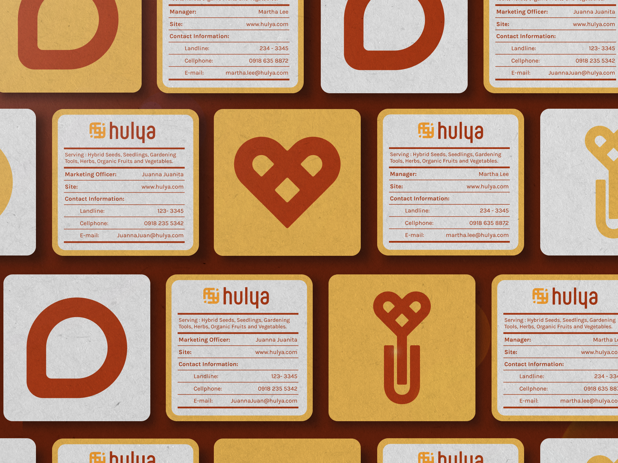
For easy identification, the products will be labelled and color coded. The label will also contain at most 3 health benefits in order to encourage the customers to buy these products, and hopefully grow their own.
Multifunctional Seed Packaging. Serves as a guide for beginner urban gardeners, and as a container for various seeds.